


How to Make an Interactive Infographic [+Templates]


Written by:
Mahnoor Sheikh

We all know the importance of using visual aids while communicating to an audience. In fact, studies show that people are able to recall 65% of visual information three days later, as compared to only 10% of written content!
But here's the deal.
Tons of people struggle with getting their ideas across visually without being all over the place—especially if they don’t know how to design.
Thankfully, this is why infographics exist.
Infographics are a great way to present facts, statistics, and other data in a visual form. They're engaging, offer lots of value and can be easily shared across websites and social media platforms to reach a bigger audience.
The best part is that anyone can create beautiful infographics.
Especially with a tool like Visme, which gives you access to hundreds of beautiful infographics templates, icons and data widgets.
And no, you don’t have to be a designer to use it!
This article will teach you some easy visual techniques to help you organize a large amount of information onto a single, yet beautiful page.

Sign up. It's free.Want to create your own clutter-free infographic?
Before you even start designing, figure out what you really want to say.
Your infographic should be able to tell a story with a defined beginning and end, and a naturally flowing journey between the two points.
And all of this entirely depends on your ultimate goal.
Once you know what information you want to communicate, you need to find an infographic layout that suits your needs best.
This handy flowchart will help you figure out the infographic type you need:

Remember, infographics are not meant to be a compilation of all the data you can find. They’re supposed to be focused and streamlined on a particular subject or idea. Pick one main topic and stick to it.
Understanding the type of infographic you need will help you further decide on how to organize your information and pick the right layout.
For example, a single-column layout works best for minimal and straightforward infographics, like a list or a mobile-first visual.
For presenting more complex information, such as a flowchart or timeline, you can opt for a multi-column layout.
Creating the perfect layout from scratch can be stressful, time-consuming and difficult, especially for non-designers.
If you don’t want to take the risk, Visme offers tons of pre-designed, professional infographic templates to help you get started.
In case you don’t find the perfect template for your needs, you can always put one together by mixing and matching different sections from various templates using our content block library.
Here’s a quick step-by-step tutorial on how to use Content Blocks.
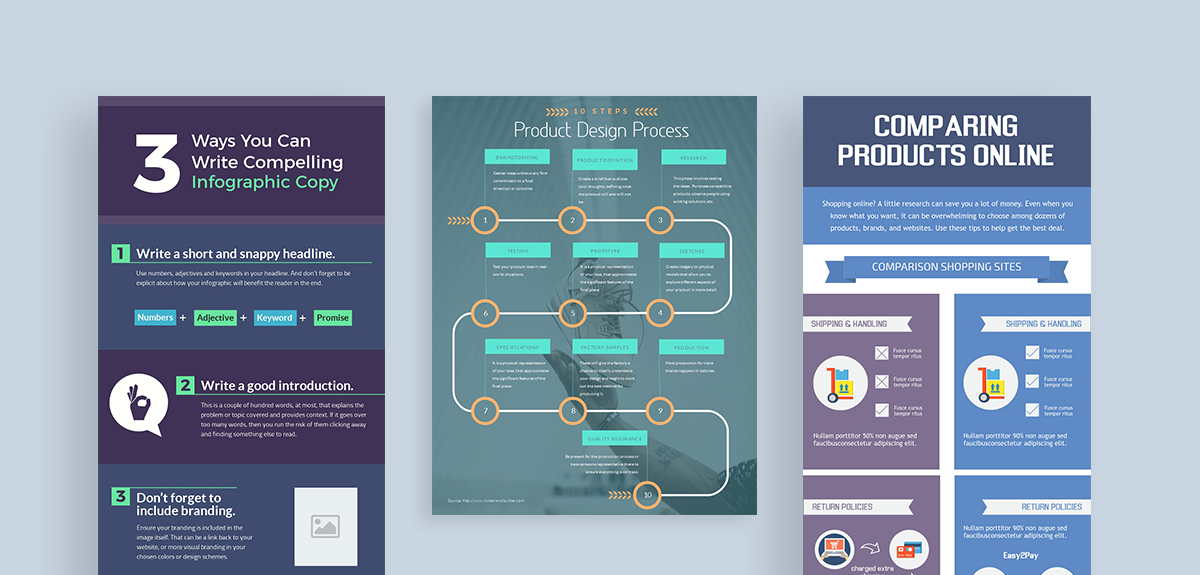
You can’t just copy and paste all of your content in an infographic—that’s not how it works. You need to break it up into different sections, or chunks.
Splitting up information into bite-sized sections makes your infographic easier to read and understand. Most importantly, it gets the main idea across without too much effort on the readers’ part.
In the example below, notice how the infographic on the right has condensed all the information into a clean design, focusing only on the main points and using numbers and graphics to highlight the important ideas.

While editing the content for your infographic, try to grasp the big picture. Make sure you focus on using the least amount of words as possible.
Study your text content carefully and highlight the most important information. You need to figure out a way to organize this information under short and specific subheadings, sections or key points.
Don’t worry too much about going into the details or illustrating your ideas with words. This is what visuals are for (literally)!
You don’t need to cram your infographic with text and graphics.
Use ample white space, or blank areas in your infographic, to let the rest of your content breathe. It will make your infographic look cleaner.
White space could be anything—from margins and padding to the space between your columns, text and objects.
Of course, using too much white space can make your infographic look incomplete. You need to find the right balance.
It's also a good idea to use section dividers, such as lines or other shapes, between different sections of content to give it some breathing space.
It makes your infographic look less crowded and visually breaks up content into chunks that are easier to read and understand.
The key to creating an attention-grabbing infographic is to ‘make it pop’.
In simple words, this means you need to create a sharp contrast between the infographic background and the elements you place over it. The best way to do is by choosing the right colors or images for your infographic.
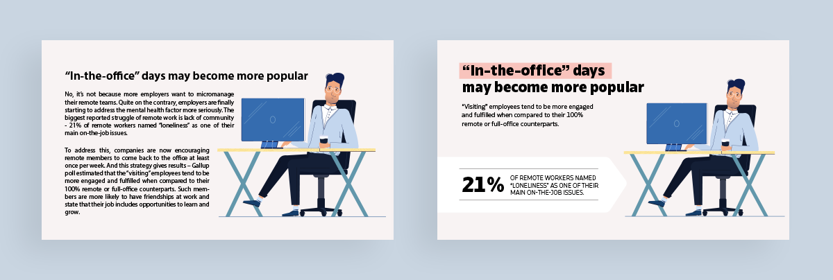
Take a look at the example below:

Notice how the infographic on the right uses contrasting colors. Suddenly, the visual is easier to read and looks more attractive!
This is the power of good contrast.
Using contrasting colors in your infographic can help reinforce your point, evoke the right sentiments and make your visual stand out.
In the same way, a background that doesn’t make your visual or text elements pop can easily destroy your entire infographic.
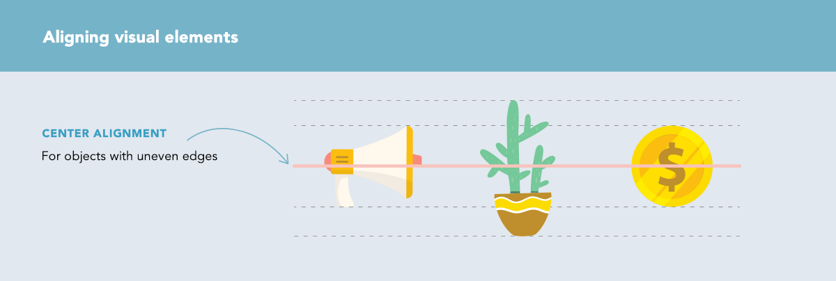
Aligning all the elements in your infographic—text, images, icons, etc.—can make your visual look more organized and clutter-free.
A sharp and orderly design looks clean and is easier on the eye, compared to throwing your elements all over the place. Alignment gives your content structure and makes it easy to understand.
Let's dive into the details of aligning your infographic elements.
Objects include icons, graphics, charts and other visual elements. These can either have flat or uneven edges.
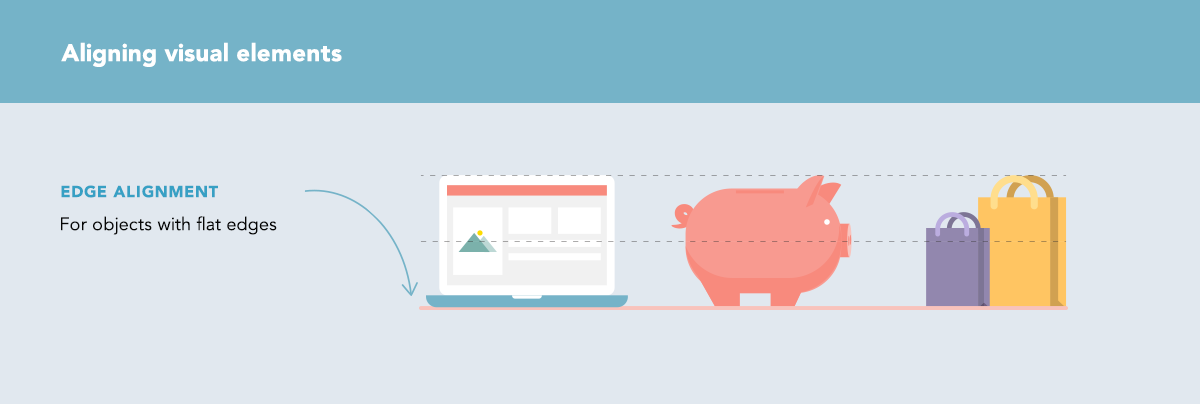
You can align text to look more attractive and structured instead of just plain haphazard. Aligning text properly actually makes your content look readable and less complex.
Here are the different types of alignment you can use for text, depending on the nature of the content and design:

We’ve already talked about how you shouldn’t use too much text in your infographics. How about taking it a step further?
Once you’ve chopped up your content into bite-sized pieces, look for opportunities where you can actually replace some of the text with icons.
Icons are a great way to make your infographic visually engaging and impactful. More importantly, they help you save tons of space and make your infographic look clean and professional.
Numbers and statistical data can easily clutter your infographic, especially if you just throw in the data as it is directly from your excel sheet.
The good news is that data can easily be presented in a visual and even colorful form. Think bar charts, graphs, diagrams, maps and more.
Visme lets you present data visually with 44 types of charts and graphs. Need some more inspiration? Check out these stunning data visualization examples to get your creative juices flowing.
You can also use Visme’s data widgets to quickly create visual representations of stats, figures and values:

Visualizing complex data can not only declutter your infographic, it can help viewers easily identify patterns and key takeaways.
If you have a ton of data you'd like to visualize, you don't even have to worry about typing it all up manually. Visme lets you import all your data in one go directly from Microsoft Excel or Google sheets. It's that simple.
The secret to creating a beautiful and clean infographic that’s also rich with information is to maintain consistency and visual hierarchy.
This goes for all the different elements involved—from the overall theme, mood and color scheme to the choice of fonts, icons and graphics.
For example, using too many colors can easily make your infographic look crowded, messy and all over the place.
That’s because colors also come with their own personalities—each one evokes a certain mood or sentiment. If you throw in multiple colors that don’t go well together, it can complicate your visual and reduce its impact.
Instead, pick an appropriate color scheme for your infographic—we recommend using two to three colors at most. You can easily create a custom color palette using a tool like Coolors or Paletton.
The same goes for all your other visual elements, such as images, fonts and icons. Consistency is key to creating good design that communicates effectively, engages, and looks structured and attractive.
If you'd like to learn more about visual hierarchy principles, check out this video by Visme that explains everything in detail:
Creating a clutter-free infographic that’s also rich with insightful stats, facts and other data can be challenging, especially for non-designers.
This is exactly why tools like Visme are so popular among marketers who want to speak visually to their audience but lack the technical skills.
You can create clean and attractive infographics in minutes using templates, color themes, a drag-and-drop editor and thousands of icons, fonts and images just a click away.
Sign up for Visme today and create beautiful infographics.
Here are additional resources to help you out:
Did you find this article helpful? We’d love to know. Feel free to ask any questions, or leave your comments and suggestions below!
Design visual brand experiences for your business whether you are a seasoned designer or a total novice.
Try Visme for free


About the Author
Mahnoor Sheikh is the content marketing manager at Visme. She has years of experience in content strategy and execution, SEO copywriting and graphic design. She is also the founder of MASH Content and is passionate about tea, kittens and traveling with her husband. Get in touch with her on LinkedIn.